In Russia's war on Ukraine, maps can tell a misleading story
Ukraine - Amid Russia's brutal and chaotic war against Ukraine, maps have become one of the key visual aids to many online observers. But one expert warns that simplified representations can be misleading.

Mateusz Fafinski, an expert on maps and the way they tell stories, explained how some visuals of Russia's invasion can actually play into the Vladimir Putin's hands.
Fafinski, who worked at Stanford and is now active at the Free University of Berlin and the University of Lausanne in Switzerland, dropped a detailed Twitter thread to explain how maps from the Guardian, The New York Times, and other outlets can unwittingly push a narrative.
"For all we know, Putin's forces are present in most of the areas highlighted [on these maps] as 'under Russian control'. But apart from Crimea and Luhansk and Donetsk separatist areas, they don't actually control all of it," he wrote.
Fafinski pointed out that maps can be very useful tools to help you get the gist of where countries and regions are. But even if they show you the layout of Ukraine and Russia's presence, they can't show you the nuances of what's really happening on the ground.
In Ukraine, this has a very real impact on how we think about the war, and can actually create false impressions.
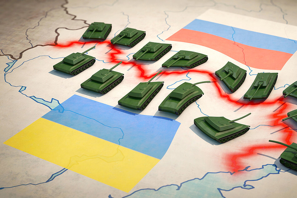
As an example, multiple maps of Ukraine tend to have regions colored in and listed as "under Russian control," but this oversimplifies the situation and makes it look like Russia has taken over those areas completely.
Maps always tell a story

While Fafinski warns of potentially misleading maps circulating outside of Russia, the Wall Street Journal also pointed out how Russian state media outlets are spinning their own story with maps.
Part of their video report highlights a map of Ukraine from the state outlet Russia-24, which breaks up the country into various regions "gifted" by past Russian leaders.
Even outside of Russia's war against Ukraine, maps influence how you think about the world.
Here's a great example for you, courtesy of National Geographic: you probably think of South America as south of the USA and Canada, which is totally correct. But you might NOT realize how far east of Florida most South American countries stick out into the Atlantic.
This just goes to show that no matter how you draw a map, it will always tell a story, and change how clearly you see the world.
And right now, the story told by the maps of Russia's invasion could very well be clouding our view of the war.
"The situation might change in the near future. But for now we should try to think in a more fuzzy way," Mateusz Fafinski cautioned.
So the more simple and clear a map appears, the bigger the pinch of salt that you take it with should be.
Cover photo: IMAGO / IlluPics (stock)

